Seeing Power through the Map

Seeing Power through the Map
By John Zarobell April 27, 2017
In-depth, critical perspectives exploring art and visual culture in the Bay Area.
Maps and visual art have a long shared history but two current exhibitions in the Bay Area demonstrate that maps are a particularly rich means to explore contemporary political issues. Seeking Civilization: Art and Cartography at Gallery Wendi Norris and Mapping the Unchartered at the Richmond Art Center are two projects that encourage viewers to reconsider maps and the ways that they reframe dimensions of power. Seeking Civilization works to reimagine an exhibition with the same name that was held at the Museum of Modern Art, New York in 1994. This mapping of a previous show uses as its centerpiece Miguel Angel Rios’s major work, Le Premier Voyage à L’inconnu (1992-93), originally featured at MoMA. The exhibition at Gallery Wendi Norris brings together seven artists who use and generate maps in various media. The result is a group of works marking space and time in an era when borders are both disappearing through transnational exchange, and being further reinforced by political will. Once considered as a descriptive and objective art, mapping has always been a means to spread a certain perspective but it seems expressly political in this era of resurgent nationalism.
1992 was the 500th anniversary of Columbus’s voyage to the western hemisphere and Le Premier Voyage à L’inconnu is clearly a response to the commemorations of that anniversary; Rios literally re-presents the map that Columbus made as a result of this journey. A reproduction of the map has been printed on canvas, cut into vertical segments and pinned to the wall to create rippling visual effects. The result is a dynamic object, part print and part sculpture, that reinforces the notion that maps are subjective even if we take them to be the result of critical observation and scientific recording. Seeing the work from different angles, the central form of the map in the shape of a ship’s hull is visible, but the object shifts and changes as the viewer moves around it. This map features not only what was then previously unchartered territory, but a form of knowledge that was imposed upon populations inhabiting the islands of the Caribbean,as well as North and South America. While the map records a systematic effort to find useful information to bring back for Columbus’s sponsors, the King and Queen of Spain, it is also t he transliteration of a series of encounters with land, sea, and people.

Guillermo Galindo. Typical Secret Document (A), 2015; Mixed media on double sided cut paper.
Courtesy of the Artist and Magnolia Editions, San Francisco.
The result of these encounters is what we now call colonial history, and so the map can readily be seen as negotiating the domain of power. Other works in the show expand on this dynamic, including Michael Arcega’s Prih-Sohn Stick Chart (Map of isolation chambers) (2015) which is derived from a stick map, the kind used by indigenous navigators of the South Pacific, with string attaching sticks of various lengths into a unitary structure. His use of this alternative model of mapping has the effect of reminding viewers that the visual language of European mapmaking norms is not the only one, but rather one among many. Like Rios’ image, Arcega’s map also features America, but the geopolitical unit of the United States is easily recognizable. The work represents solitary confinement units in the U.S. prison system, marked by crystals affixed to sticks, and suggests that maps are not only for representing geographical features but can also signify broader social developments like the booming prison industry. Another innovative map, offered by Omar Mismar, is The Path of Love #03 (2013-14), a neon wall sculpture that charts the artist’s journeys to get close to men he found through the website Grindr. This map concentrates on the subjective experience of navigating a city through personal longing.
Taraneh Hemami’s work, Recounting (2011), takes the idea of the map personally. This round, pigment and inkjet print on paper and velum is a palimpsest of dates, written in Georgian and Persian letters, that forge an account of the days of the artist’s life in the form of a traditional Persian calendar composed through concentric circles. The dates in the center are those that the artist spent in her native Iran, while those printed on the external circle represent her time in exile. Certain dates, printed in blue, indicate moments when the artist was in transit. This conceptual map does not represent space so much as time, but time is clustered so that days overlap one another preventing legibility, and our yearning for time’s linearity. Mapping time in this way opens a space of contestation in which memory is the thread that holds distinct political regimes together, even as they pull further apart; all the while, the single body of the artist is expanded to encompass multiple notations of time that place political realities in the fragile context of a human life.

Michael Arcega. Prih-Sohn Stick Chart (Map of isolation chambers), 2015; Bamboo, metal, and quartz crystals; 60 x 48 x 3 in. Courtesy of the Artist and Gallery Wendi Norris, San Francisco.

Diane Rosenblum. Yayoi Kusama Painting 1989–2005, 2006; Archival pigment print on canvas; Edition of 5 + 2AP; 40 x 76 in. Courtesy of the Artist and Slate Contemporary, Oakland.

Guillermo Galindo. Siguiendo Los Pasos del Niño Perdido, 2017; Acrylic on beacon flags used by humanitarian aid group Water Stations; 30 x 47 in. Courtesy of the Artist, Gallery Wendi Norris, San Francisco, and Magnolia Editions, San Francisco

Miguel Angel Rios. Le Premier Voyage a L'inconnu, 1992-93; Cibachrome mounted on pleated canvas with push pins; 63 x 126 in. Courtesy of the Artist and Gallery Wendi Norris, San Francisco.
prevnext
Political realities, like that of the U.S.-Mexico border, are the subject of Guillermo Gallindo’s prints on flags that once served as markers of water tanks for use by migrants crossing the border in the Calexico desert. In Siguiendo Los Pasos del Niño Perdido (Following the Steps of the Lost Child) (2017), crossing lines in various colors create an intricate network of traces. These traces suggest the steps of a lost child while also operating as a score for a musical composition, the kind the artist performed at the exhibition opening on March 23rd. Here, one encounters a relic from a politicized borderland, which documents migrants’ journeys from one country to another. Based on the intertwined paths printed on the map, the viewer is uncertain whether the child ever arrived.
Gallindo’s work—both prints and music—is also featured in Mapping the Unchartered. In Richmond, the artist exhibits more printed flags, but another printed musical score is notable. Titled Typical Secret Document (2015), this two-sided print features architectural diagrams and cross-sections of the current border wall with four rows of dot patterns punched through, looking a little like a script written in Braille. On the other side is an abstract composition of lines that, when combined with the dot pattern, functions as another musical score. If necessity is the mother of invention, the barrier in this case is the mother of both illicit migration and art. There is no question that this work, created before the last presidential election, now generates a potent political statement.
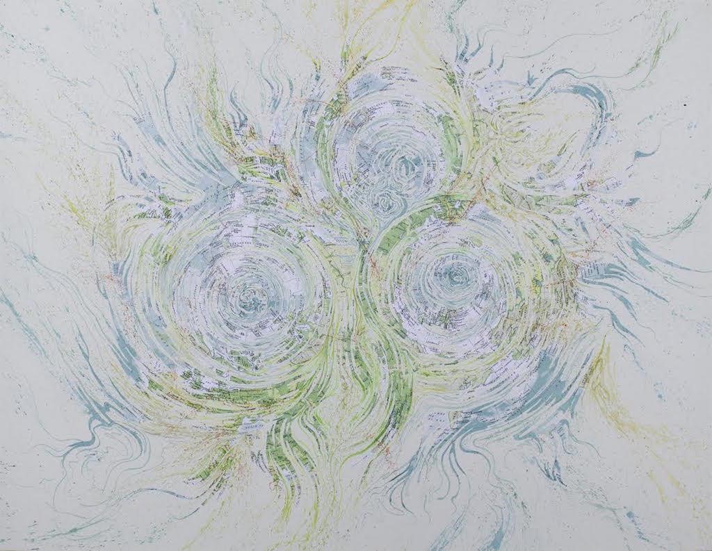
Mark Garrett. Three Arctic Cyclones, 2014; Collage and watercolor; 30 x 39 in. Courtesy of the Artist.
What Gallindo reminds us here is that the mantra of Trump supporters: “Build the Wall!” demands the construction of a structure that is already there. The political fantasy pays no heed to the reality on the ground, nor its apparent lack of effectiveness. If Trumps’ political movement is born of this kind of misconception, it would be inadequate to point out the foolishness of such a demand. It is more productive to inquire into the function of this political illusion. What Gallindo achieves, through his printed flags and musical compositions, is to create art that manifests the presence of both truths and lies that generate this “Borderlandia.” This no-place, explored previously by artists such as Enrique Chagoya and Guillermo Gomez-Pena, cannot be mapped scientifically because it is a state of mind. The objects Gallindo has collected from this no-man’s land, including empty water bottles and shotgun shells, may be repurposed as musical instruments, but they testify to a complex history in which militias shoot holes in water tanksmeant to save lives while American border guards buy tacos from Mexicans through a hole in the wall. Perhaps if one joined the titles of these two shows: Seeking Civilization: Mapping the Unchartered, one might better appreciate the everlasting dynamic of America.
While Seeking Civilization focuses more on the relationship between the artistic map and the realities of the world that can be translated through it, Mapping the Unchartered examines the map as a symbolic object that develops a language or code for representation. The artists in this show work with maps to develop artistic languages that give form to broader social realities. For example, Diane Rosenblum’s highly inventive graphs chart the auction value of works by artists in their own artistic language. These are not maps properly speaking, but they nonetheless “map” value. This makes for visually dynamic works and, if the viewer knows the artists’ styles, she will get the joke. While these works are clearly questioning the equation of artistic success with market valuation, the works do actually present a visual display of quantitative data. The challenge Rosenblum presents is how, and whether, an artist can ever be considered greater than the market for her work. On the other hand, Mark Garrett draws existential significance from the maps he employs as background elements in painted works that he cuts, collages, and reinvents with calligraphic flourishes. His map of Europe from 1939 is dripping with pathos, but more playful is Three Arctic Cyclones where ocean intersects with splayed land masses. Mapping land masses on a flat plane is a process of signifying substance, but this visual metaphor is nullified by the artist’s virtuoso use of razor to cut the maps and watercolor to embellish them. These maps are thus denatured, but it is hard to look at a mash-up of ocean and land and not think about the effects of rising waters as a result of global warming.

Omar Mismar. The Path of Love #03, 2013-2014; Neon; 126 x 126 in. Courtesy of the Artist and Gallery Wendi Norris, San Francisco.
Lordy Rodriguez has generated aerial views of urban spaces through a restricted vocabulary of lines and dots traversed by curving gestures of watercolor that stand in as rivers. Like his best works, these pieces build on patterns that extend as if organically, constructing the illusion of civilization amidst an expanse of paper. A very different mapping technique, employed by Indira Martina Morre in Signs I and Signs II (2012), illuminates a central theme of this exhibition. Morre has created circular forms composed of many smaller symbols developed by Apple, such as the “home” symbol and what is known colloquially as “the spinning ball of doom.” These are symbols generated by a corporation to guide users in the effective use of its software. Morre’s work presents these ersatz signs, gathered into masses and patterns, to suggest something more than they were designed to mean. When these symbols multiply and are grouped into larger forms, they suggest a larger domain of mediated experience that using Apple software draws all users into, like it or not.

Indira Martina Morre. Signs II, 2012; Graphite, ink, and gesso on linen over panel. Courtesy the Artist.
Seen in the context of mapping, the two drawings by Morre help to focus the viewer’s attention on a core issue that maps address: namely, the effort to develop a representational system to explain something that one can only imagine. The impulse of showing the state of the world through visual means is what maps accomplish even as the world we inhabit becomes ever-more virtual, and the tentacles of power increasingly opaque. Once a document of conquest, the map recreates the spaces that the mind traverses and occupies, creating networks for later exploration. As a means of representation, maps are reimagined and critiqued by artists in these twoexhibitions and the underlying authority of maps is renegotiated. Viewers must make sense of each of these artistic maps and, in so doing, find their way in the world. Everyone is subject to power, but these maps help one to see through it.